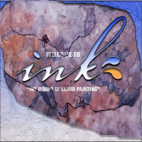
Final works
Progress works...
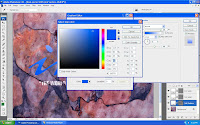 First, I change the color of the fonts to make it look like water and adjust the shadow.
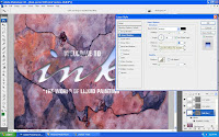 I go to layer style and click inner shadow onto it to play around the shadow so it looks more real.
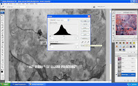 Then,I created another copy of Green on the channels and adjust the layer so that I can get better looks.
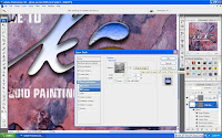 I'm back to the layer style and apply beveal and embose on ink splat layers,playing around with the depth and also unclick the "Link with layer" .
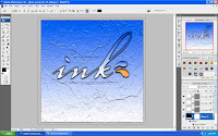 After apply drop shadow, inner shadow , outer glow , beveal and emboss and gradient overlay, on the shape layer, I put white as a foreground and this is how it looks like.
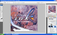 Lastly, I apply the brush tools brush some of the area that I want randomly to make it more balance and before use the brush tools I need to click on the style type on the right side of the options.
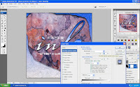 Oh yeah, I had to go back to the layer style, and on the blending options:customs, I adjust the opacity above it to make the water effect combine with the rock so that it look more real.

No comments:
Post a Comment