Monday, December 22, 2008

Assignment 2

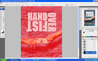
Final work is done!!


5. At last, I add in those font at the bottom play around with color (hue/saturation) and some fill
some gaussian blur on it and the picture on the left side.

4. Add two more picture into the wallpaper on the left side on top right side and apply the same
mode from the first image that i put in earlier.

3. Add in filter on render lens flare.

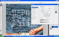
2. Change the opacity on the background picture and change the blend mode option to soft light.
Then I put in the first picture on the right side of the background and apply the layer
adjustment so that I will combine it with the background.

1. Add shadows on the Multimedia University logo. Drop shadow , Inner Glow , Outer Glow.
Project Charter for Assignment 2


Assignment Title: Digital Wallpaper

Project Start Date: 8 December, 2008

Project Finish Date: 23 December, 2008.

Project Manager: Adrian Meringai

Email: mcg1014.1061102561@gmail.com

Website: http://www.mcg1014-1061102561.blogspot.com


------------------------------------------------------------------------------------------------


Project objective : I’ll be doing the digital wallpaper for MMU FOM open day
to new future student and showing them the quality of
the faculty by looking at the wallpaper that I created for
FOM faculty to attract people to come.

Approach : I be designing this MMU FOM digital wallpaper by using the
my own camera to capture good quality picture of FOM
building. The size of this digital wallpaper is A4 size and
I will be using Adobe Photoshop CS3 software to design it.

I be using the layer technique to do the editing part of the
picture. Using marquee tools brush tools and eraser tools
as well. I apply the layer mask on the fonts too. Using filter
tool such as Gaussian blur, motion blur, drop shadows as well
as adjusting the color by using hue/saturation.

Since I designing the FOM digital wallpaper, I will put big fonts
or signs at the digital wallpaper so that it can show more
clearer understandable whereby the digital wallpaper that I
design for MMU FOM is to promote the faculty.

Roles and Responsibilities


- Get good ideas to sketch the image and try find the image in websites and or use own picture.


- Edit pictures taken in the website or from personal camera and put it inside the wallpaper.


- Submission


Comments


Well, I get a little bit hard for me to catch up the knowledge of Photoshop properly by not using the video tutorial to do so because every time I try to apply those layer masking didn’t work that well for me but Assignment 2 is really interesting assignment for me because this Assignment 2 makes my mind thinking out of the box to create cool stuff.


Sunday, December 14, 2008

Tutorial 6

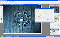
Final works....Cheers!


Progress
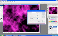
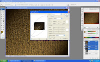
1. First create a new layer and apply render difference clouds onto the background and then create a new layer mask and apply hue/saturation.

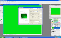
2. Create a new layer and choose color as a background and go to render lighting effects.

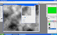
3. Go the the channel tab,click on the Alpha 1 and apply clouds and add noise to it.

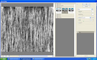
4. Go to filter menu and choose distort and click on glass.

5.Then, it will automatically create it on new layer Alpha 2.Go back click to RGB and click again the render lighting effects and this time at the bottom of the option there is mode called tecture channel and apply it to Alpha 2.

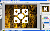
6. The important part is, there is a logo on the path and I choosed this logo and back to layer option and create a new layer to it.

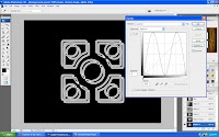
7. Press ctrl + M do the M shape at the graph balance it follow the line provided to it.

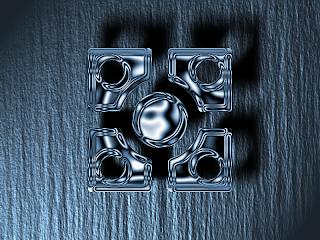
8. Lastly, bring back the chrome background that I created not to long ago and change the color on the logo as well by using hue/saturation to colorize it so that it look the same color.

Tutorial 5

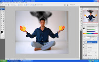
Final works

Progress...

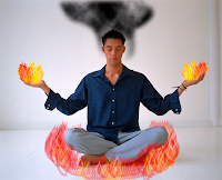
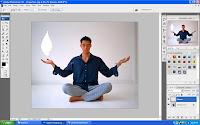
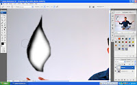
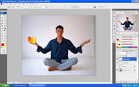
1. Use lasso tools to create a flame image but before that must create a new layer on it.

2. I apply those shadow on the flame using the brush tool so that it looks more better.

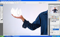
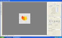
3. After I created a flame figure, I define brush preset on it so that I can do a multiple flames using brush tools.

4. To add a color on the flames, first I must create a random size of rectangular on the marquee tool and use red and yellow color and go to filter choosing render clouds.After that, I press shift+ctrl+ I to apply the color on the flames only.

5.I go the filter menu and click liquify mode on it, then I click "swirl" button and apply it to the flame that I choosed so that it look more pretty flame object.

6. Lastly, I put the smoke on the person's head which I use lasso tools to create a random design on it then again I apply render clouds and change the layers to multiply. Before I finish everythin,I add more flames on the floor around him just for fun as you can see on the Final works.

Thursday, December 11, 2008

Tutorial 4


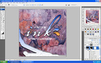
Final works


Progress works...
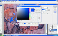
First, I change the color of the fonts to make it look like water and adjust the shadow.

I go to layer style and click inner shadow onto it to play around the shadow so it looks more real.

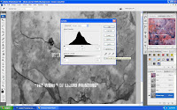
Then,I created another copy of Green on the channels and adjust the layer so that I can get better looks.

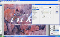
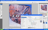
I'm back to the layer style and apply beveal and embose on ink splat layers,playing around with the depth and also unclick the "Link with layer" .


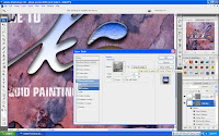
After apply drop shadow, inner shadow , outer glow , beveal and emboss and gradient overlay, on the shape layer, I put white as a foreground and this is how it looks like.

Lastly, I apply the brush tools brush some of the area that I want randomly to make it more balance and before use the brush tools I need to click on the style type on the right side of the options.

Oh yeah, I had to go back to the layer style, and on the blending options:customs, I adjust the opacity above it to make the water effect combine with the rock so that it look more real.

Thursday, December 4, 2008

Tutorial 3

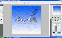
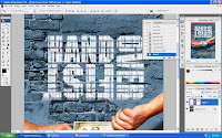
Final work.

STEPS

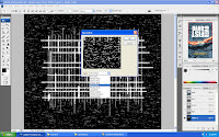
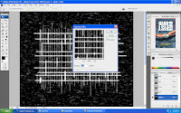
First I created a new layer on the channel.Then, I use the Line tool to create a straight line on the fonts.

I use mezzotint from the pixelate to make the line looks more real.


Add a little of gaussian blur on it as well.


I go back to layer and create new layer , add vector mask and I press ctrl + shift + backspace to do the invert on the font that I did earlier in the channel tab. This is exactly what I learned from the video tutorial and it is really helpfull and fun.


Then I go to edit menu and choose stroke to change the fonts style to make it look more clean than before and the width I put 10 px .


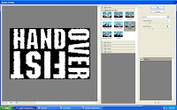
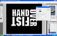
After I done with the stroke, I press B to go for brush tool and go to the filter menu and head to brush stroke and choose spatter.I just play around with the spray radius and the smoothness to get the best look of it.

Lastly,I go to the layer that I created not to long ago and double click on it will appear the layer style.On the blending option, I change the setting on the underlying layer so that it will look real.